
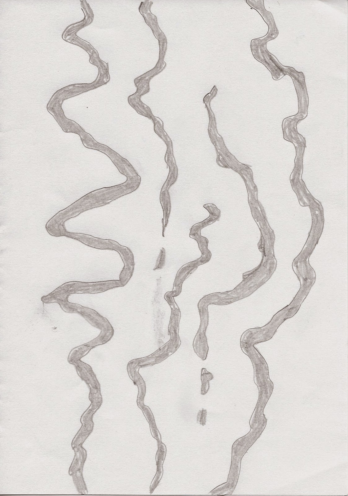
The basic idea I liked, but the combination of these squiggly lines did not really thrilled me. But as you know, something you just have to give an idea a bit more time :-). And that is what I did. This morning I knew what I wanted to do with it. It had to be more simple and much bolder. This is the fabric sample I made:

-
wow that's really strong, bold and definitely linear!
it would look very good horizontally too...
it has a very modern feel to it, clean and classic.
I think it works very well...at first the impact hits you but then you begin to let your eyes explore all the ins and outs..
It's well balanced, it's striking and interesting.
The only thing I'd check, student 3, is the value pattern. How strong is this if you desaturate? could it lose impact in a very low light situation? I like the way the grey is darker than the red in places, and lighter in others - if you do this one again you could exaggerate that effect.
Otherwise it looks great!
I'd be careful with the quilting pattern and give it some thought....print out a few pictures and draw possible quilting designs on top of them....the quilting will be very obvious so it will be important to get it right.
I'd be careful with the quilting pattern and give it some thought....print out a few pictures and draw possible quilting designs on top of them....the quilting will be very obvious so it will be important to get it right.
-
I admit that I had not desaturate the picture before I send it to EB and she is correct. Here is the b/w version of the picture:

The red and grey are too close in value. Something I have to keep in mind when I dye the fabric.
2 comments:
I like how this is coming along, Wil. Although the squiggle and the lower right-hand red section are close in value, the fact that the former is a cooler colour than the latter does provide some contrast. I'll be interested to see how your final piece turns out.
I like the way the squiggly line comes and goes when you desaturate,I think it adds further depth to the piece.
Post a Comment